Mariners Guide to the 500 Millibar Chart
Joe Sienkiewicz*, NOAA National Weather Service, Ocean Prediction Center
Lee Chesneau**, Lee Chesneaus Marine Weather
"Big whirls have little whirls which feed on their velocity.
Little whirls have lesser whirls, and so on to viscosity."
L.F. Richardson
The first version of this article appeared in the December 1995 edition of the Mariners Weather Log. It has only taken us 13 years to update the article. Nearly all of the thinking is exactly the same. We have updated all of the figures to include satellite images and have added a small section on tropical applications. We have also added web references where appropriate.
Detailed weather information is so readily available today in a variety of formats, that it can be overwhelming. For those willing to expend the time and effort to analyze these data, the rewards can be gratifying. For mariners, especially professional mariners, the same can be said for those who take their formal required training and at sea experience seriously in learning and applying the basics of the variety of surface and 500 Millibar (mb) charts. The weather information is still communicated via old reliable and free technology High Frequency (HF) Single Side Band (SSB) radio-facsimile broadcasts, as transmitted by the U.S. Coast Guard from its communications facilities NMF (Marshfield, MA), NMC (Point Reyes, CA), and NJO (Kodiak, AK). All transmit seven 500 millibar (mb) charts each day (two analyses, two 24 hour forecasts, two 48 hour forecasts) based on the forecasts cycles of 0000 UTC and 1200 UTC, and one 96 hour forecast based on the 1200 UTC forecast cycle. The same information can also be obtained through the internet and via satellite and non satellite email based systems such as through the NWS FTP email service (see http://weather.noaa.gov/pub/fax/ftpmail.txt). For secondary opinions to assist mariners in marine weather forecast and vessel routing decisions, a mariner can turn to consulting meteorologists for advice. The final responsibility however, still lies with the Master Mariner of a large commercial container ship or the skipper of a coastal cruising sailboat. It is the prudent mariner who uses all available resources to make their own final decision.
The professional mariner and ocean going sailor can use the 500 mb analyses and forecasts, in combination with surface pressure and wind and wave charts, to better understand and anticipate the workings of both the ocean and atmosphere. It first takes some basic knowledge of marine weather, not just surface weather charts but also 500 mb pattern recognition experience, to be able to make better educated and more self reliant decisions concerning upcoming weather.
Note: UTC (Coordinated Universal Time), is the same as GMT (Greenwich Mean Time) and Z (Zulu time),
Big Ben
time, and will be used extensively in this article.
*Joe Sienkiewicz is the Applications Branch Chief and Science and Operations Officer of the NOAA Ocean Prediction Center (OPC) (www.opc.ncep.noaa.gov).
** Lee Chesneau, formerly was a High Seas Forecaster in the Ocean Forecast Branch of the OPC, located in Washington, D.C. Lee now owns his own company (www.marineweatherbylee.com).
Co-author: Heavy Weather Avoidance and Route Design, Concepts and Applications of 500 MB Charts, Ma-Li Chen and Lee S. Chesneau, Paradise Cay Publications. He can be contacted via e-mail Lee@chesneaumarineweather.com.
Surface weather charts that depict isobars encircling high and low pressure centers and weather fronts (cold, warm, occluded, stationary) and non-frontal features (troughs and shear lines) are familiar to mariners. The general perception is that surface low pressure systems are associated with bad weather. As can easily be seen in Figure 1, the clouds in white are associated with the frontal system extending south and southwest from the Aleutians and the 1000 mb low north of Hawaii. Surface high pressure systems (northwest of Hawaii near 37°N 172° W and west of California) mean low winds near the center with generally fair weather (notice the absence of clouds northwest of Hawaii), but there is much more to it than that. Isobars are lines of equal pressure and derived from barometric pressure readings much from land, ship, and buoy reports at sea. However, the surface pressure isobars are a direct measure of all of the dynamic processes that are happening in the atmosphere, from upper and mid-levels, down to the surface. These processes include cold, drier air sinking from aloft, and warm, moist air rising to very high altitudes which result in the generation of clouds and precipitation, as well as air streams coming together (converging) or spreading apart (diverging). The surface pressure pattern depicted on surface weather charts is actually a two dimensional representation of the three dimensional atmosphere!
If you look at a surface map and think that the low pressure system over northern Michigan today will be over eastern Maine tomorrow and will affect my vessel the day after, you are forecasting by continuity. This is moving the existing state of the atmosphere (surface lows, fronts, troughs, highs, and ridges) around the earth without taking account of all the processes involved. In the early part of the 20th century, that was the way meteorologists first forecasted surface storm (low pressure) systems.
If you learn anything from this article, remember that the atmosphere is dynamic! The surface pressure field responds to changes in the atmosphere aloft and vice versa. Surface low pressure systems have life cycles: they form, some grow and strengthen (even to hurricane force) and eventually they spin down and die. An average life span is five days from birth to death (Note the OPC generates forecasts through 5 days or 120 hours). The intensity and length of life of a surface low pressure system is a direct result of interaction between the lowest level in the atmosphere as well as the mid and upper levels. An excellent measure of this interaction is the 500 mb height field.
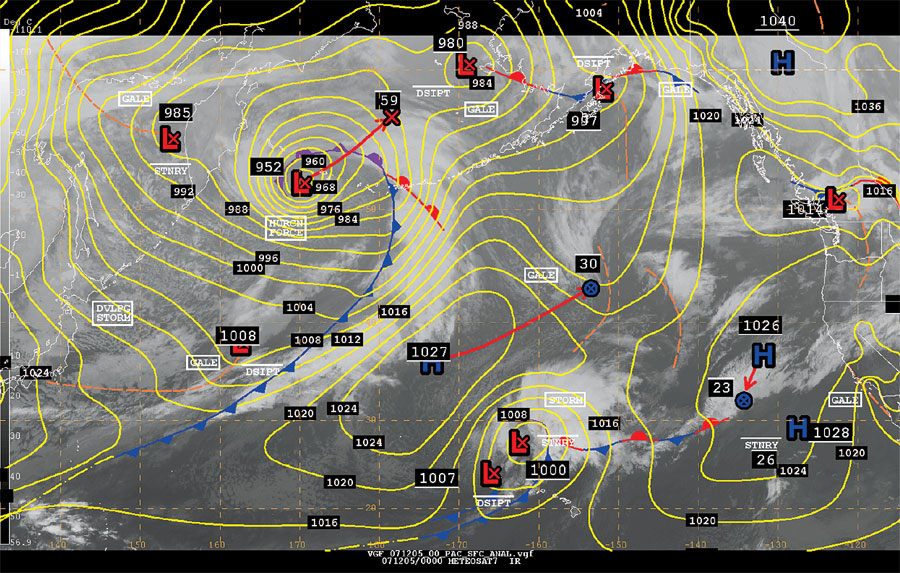
Figure 1. NWS Surface Analysis from 0000 UTC 5 Dec 2007 showing fronts, isobars, lows, highs, and ship observations. Infrared satellite imagery from geostationary satellites is also shown.
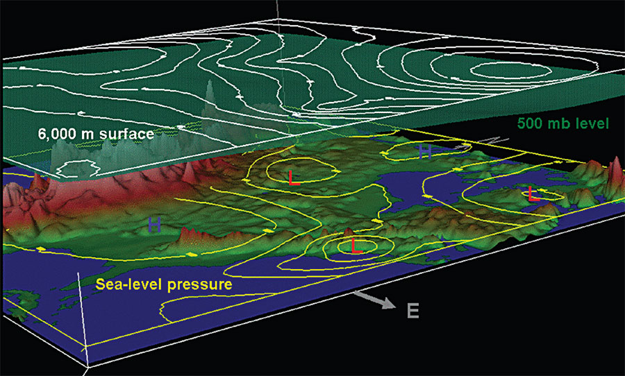
Figure 2. Compare this three dimensional depiction from 0000 UTC 10 Dec 2005 of: sea-level pressure in yellow contours, the height of the 6000 m constant altitude surface depicted in pressure values (mb, white), and the 500 mb constant pressure surface in transparent green shading.
The 500 Millibar Basics
The 500 mb surface is a constant pressure surface approximately midway up in the troposphere (the lowest layer of the earths atmosphere). The pressure exerted by the air column above this level is exactly 500 mb, but the altitude or height of this surface varies. The 500 mb constant pressure surface averages approximately 5600 m (18,000 plus ft) in height, but can vary from roughly 4700 m in an extremely cold (more dense) atmosphere near the poles to nearly 6000 m in a very warm (less dense) atmosphere near the equator. When mapping weather above the surface, constant pressure surfaces are preferred to constant height surfaces because the physics and math involved with the fluid dynamics of the atmosphere are better applied on constant pressure surfaces. For professional meteorologists (and mariners), the use and application of the 500 mb charts is very powerful for predicting the development and behavior of surface weather!
Shown in Figure 2 are: sea level pressure (yellow contours), the pressure level of the 6000 m height surface (above sea-level) in white, and the 500 mb constant pressure surface (green shading) for the eastern United States from 0000 UTC 10 December 2005. Comparing the 6000 m constant height surface and the 500 mb constant pressure surface you can see that the constant pressure surface actually changes with height relative to the 6000 m height surface. The 500 mb constant pressure surface descends closer to the surface as you proceed northward in latitude. This can be seen in Figure 2 by following the difference between the white line and green surface across the figure from left to right. Southeast of Florida the white 6000 m surface nearly aligns with the green 500 mb surface. As you move northward the green 500 mb surface over the Canadian Maritimes has descended significantly below the 6000 m constant height surface.
Figure 3 is a west to east cross section depiction over the United States and western Atlantic of: temperature (colored shading warm to cold colors, and purple isotherms), pressure levels (white contours), and surface pressure (yellow isobars) for 0000 UTC 10 December 2005 (the same date and time as Figure 2). The isotherms (purple lines of constant temperature) drop toward the surface above the surface low over New England forming a trough of lower (colder) temperature. You can also see that the 500 mb (and all height lines) dips down in a trough along the axis (dashed red line) where the isotherms change the most across the cross section (to the east of the trough of colder temperature). Warmer air is concentrated to the east of the trough axis (red dashed line) with colder air concentrated to the west along the dot dash blue line. This graphic illustrates the relationship between the temperature structure and the height of the pressure fields. One can also see that the dashed red line or pressure trough axis tilts westward with ascending height and is typical of a deepening storm system. There will be more on this later.
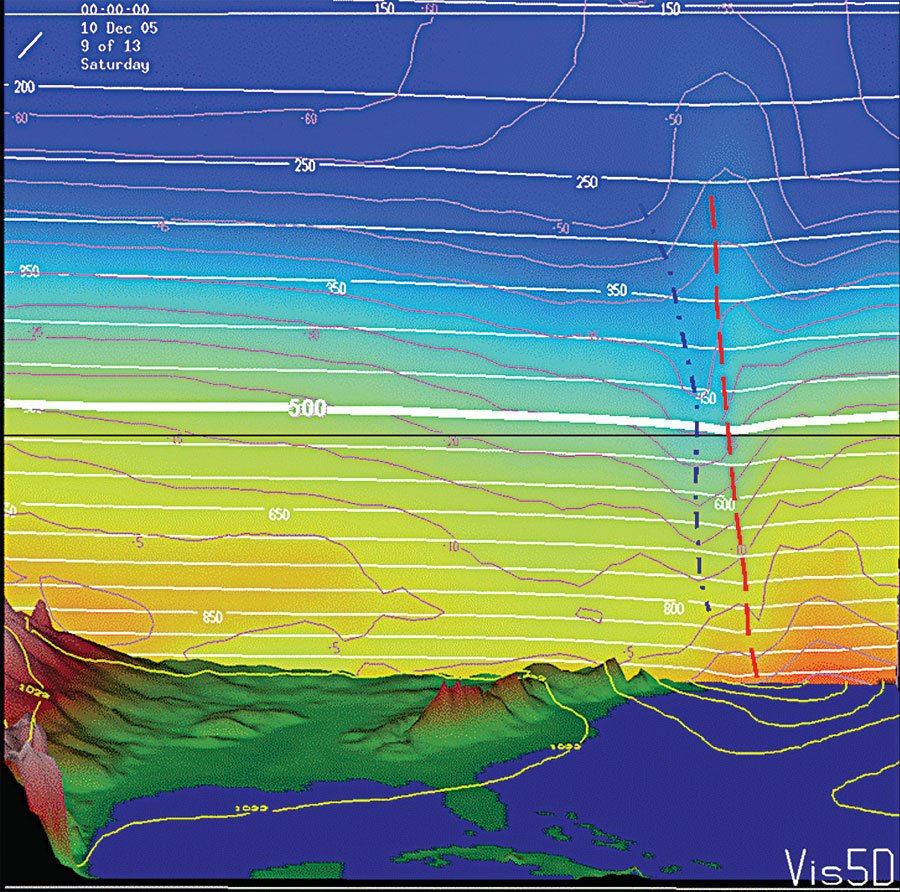
Figure 3. Depiction of west to east cross-section from 0000 UTC 10 Dec 2005 across the United Stated showing constant pressure surfaces (white contours), air temperature in 5 degree C increments (purple contours), and air temperature in colored shading in warm to cool colors. Sea-level pressure is shown in yellow contours. Dashed red line depicts the trough in the height field as it tilts westward with height. The blue dot dash line shows the temperature trough (coldest axis) lagging westward of the pressure trough.
The solid contours shown on the 500 mb chart (Figure 4) represent geo-potential height. This representation is basically, height in whole meters with a slight difference, referenced from the earths surface. The number 564 means 5640 m. Note however, the charts from the OPC today are depicted in three digit numbers (decameters) so mentally a reader of OPC 500 mb charts must add a zero to convert to true meters. In a sense, you are looking at a topographic map of the 500 mb pressure surface. The 500 mb heights are higher in warmer air masses (less dense) and lower in colder air masses (denser). This can be seen in Figures 2 and 3. Therefore, the heights generally are lower in higher latitudes and higher in latitudes closer to the equator. In Figure 4, look at the height differences from the contour at 20°N, 160°E (5920) and south of Aleutians near 52°N, 170°E (4920 m) (approximately 1000 m difference).
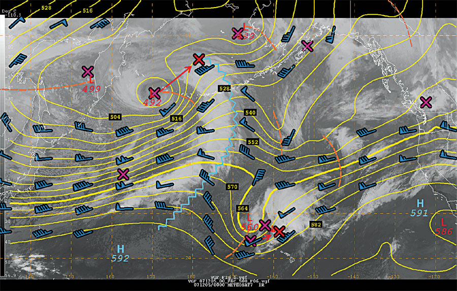
Figure 4. Depicts 500 mb analysis from 0000 UTC 5 Dec 2007 for the North Pacific. Brown dash lines indicate shortwave trough axes. The blue zig-zag line illustrates a ridge axis. Ls and Hs indicate minima and maxima of height and are labeled in tenths of meters. The purple Xs show the location of surface low pressure centers (see Figure 1) and red Xs the 24 hour forecast positions of the low centers for 0000 UTC 6 Dec 2007.
The closer the 500 mb height contours are together, the stronger the horizontal and vertical temperature contrasts, the faster the wind speed at 500 mb (the wind at this level is for the most part parallel to the height contours). A simple rule of thumb the tighter the height contours, the higher the wind speed, the stronger the temperature difference below 500 mb. In Figure 4, a strong band of southwesterly winds extends across the western Pacific from just south of Japan to the International Dateline just south of the Aleutians. Looking northward along approximately 165° E longitude the height contours are the closest together and accompanying winds at 500 mb exceed 100 kts.
Winds at 500 mb are generally not the actual core of the Jet Stream, which is usually between 200 and 300 mb but nearer the bottom half. The mariner should view the Jet Stream as a tube of air that circumnavigates each of the earths hemispheres. The Jet Stream is hundreds of nautical miles (nmi) across and about a nautical mile (nmi) deep. In other words, the Jet Steam is also three dimensional. Jet Streams exist due to horizontal temperature contrasts. In an extremely cold atmosphere, the Arctic Jet Stream can extend down to 500 mb. Meteorologists do call wind speed maxima at 500 mb Jets or Jet Streaks (in Figure 4 the strong core of southwest winds from Japan to mid-Pacific would be called a Jet Streak). On the 500 mb charts distributed over HF radio-facsimile, as prepared by the OPC, only 500 mb height contours and winds are depicted.
Ls and Hs at 500 mb represent areas of relatively lower and higher heights. A 500 mb L or H with a closed height contour around it implies that the associated surface high or low pressure system will have a closed circulation with the wind circulating around it aloft. For example, in Figure 4, a 4920 closed low can be seen over the western Aleutians near 52°N 170°E. In contrast, an open 5600 low can be seen northwest of Hawaii near 30°N, 167°W (there are no closed height contours and therefore, no closed surface circulation).
Upper level troughs are areas of relatively lower heights and are depicted as U or V-shaped in the 500 mb height contours. Several troughs are indicated in Figure 4 by dashed lines (OPCs 500 mb chart). For example, a trough extends southwest from the 5600 m low northwest of Hawaii. An area of troughing extends southeast from the 4920 Aleutian low. Another trough extends between 40° and 50°N along 159°W. In each case you can see that the high clouds (bright white clouds) exist to the east or downstream from the trough axis. This is typical. Ridges are areas of higher heights and are shaped like an upside down U or V and are indicated by a zig-zag line, for emphasis in this article (although these are not actually depicted on actual HF radio-facsimile charts). Figure 4, a strong ridge extends southeast then southward from the Bering Sea across the Aleutians, and then southwestward to the 5920 m High near 20°N 160°E.
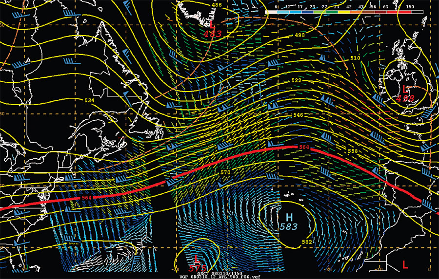
Figure 5. Depicts the 500 mb analysis for the North Atlantic valid for 1200 UTC 10 Mar 2008. The 564 decameter height contour is shown in bold red. The colored arrows show the surface wind speed and wind direction as estimated from the NASA QuikSCAT satellite. The color bar in the upper right shows the color coding of wind speeds. Yellow and orange arrows are GALE force, the brown arrows STORM force, and red (southwest of Ireland) are HURCN FORCE as you would see reflected on OPCs surface pressure charts.
On the charts distributed over radio facsimile by NMC, NMF and NJO, the 5640 m height contour is enhanced in bold. Some basic rules of thumb can be used by ocean going mariners and marine meteorologists concerning the bold highlighted 5640 m height contour and 500 mb wind maxima are as follows.
- The surface storm track (low centers) referenced to the 5640 meter height contour usually lies 300 to 600 nmi north and tracks parallel to the orientation of the 5640 m height contour.
- The surface low centers and associated fronts (cold fronts, in particular when cutting south across latitude lines) move at approximately one third (1/3) to one half (1/2) the 500 mb wind speed above.
- In wintertime the 5640 m height contour is an excellent indication of the southern extension of surface winds of Beaufort scale force 7 westerlies (28-33 kts or occasionally greater). In summer the 5640 m height contour is more representative of force 6 surface westerlies (22-27 kts to occasionally force 7). The term westerlies, infers the southwest to northwest wind shift with passing cold fronts which predominately extend south or southwestward from the storm track (low pressure centers) that are inherently to their north. In other words, the worst weather conditions are typically poleward (north in the Northern Hemisphere) of the 5640 m contour!
This rule is illustrated in Figure 5 from 10 March 2008, ocean surface winds from the NASA QuikSCAT satellite are shown by colored arrows. GALE force winds are shown with yellow arrows and the 28 to 33 kts ranges with dark green arrows. In this example, all of the GALE force winds are poleward of the 5640 m line and the near GALE winds reside along or within 100 nmi of the 5640 m height contour. - The surface wind speed, especially in the west to southwest quadrant (in the cold air) of a mid latitude surface low pressure system is approximately 50 percent of the 500 mb wind speeds, which is located in the northwest wind flow frequently experienced behind the 500 mb trough. Thus this rule of thumb is consistent with the inherent knowledge that most mariners know that the strongest wind and sea state conditions does lie in the west and southwest quadrants of mid latitude low pressure systems.
Long Waves
If you could look at a time lapse movie loop of the 500 mb height contours over the Northern Hemisphere for a year, you would see a westerly circulation undulating northward and southward as what appears to be waves of troughs and ridges passing around the globe mainly in the mid-latitudes between the poles and the equator. The bigger waves appear to stand still or move slowly for a period of time and then either break down or move westward. When a larger wave moves westward, it is said to retrograde. The smaller waves tend to move quite rapidly from west to east and tend to enhance or flatten as they pass through the larger waves. They also sometimes move north or south, and occasionally separate or cut off from the main contours which then shift north and resume their contour orientation in an east to west fashion. Loops of the North Atlantic and Pacific 500 mb analyses with satellite imagery can be found at: http://www.opc.ncep.noaa.gov/Loops/ under N Atlantic or N Pacific Products and 500 mb analyses.
The bigger waves are called long waves or long wave troughs, and have a wavelength between 4000-6000 kilometers in scale and can number from approximately three to five around the Northern Hemisphere. These waves are responsible for the overall weather pattern or surface storm track. For example, prolonged drought or excessive storminess, higher or lower than normal temperatures over an area, are a result of a long wave pattern.
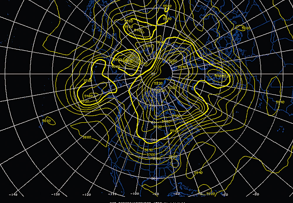
Figure 6. Depicts the 500 mb height field for the Northern Hemisphere for 1200 UTC 6 September 2008. Height contours are shown in yellow at 60 m interval. The 5640 m height contour is shown by a bolder yellow line. Longer waves are best depicted on this type of projection.
A specific long wave pattern tends not to fluctuate significantly for a period of 10 days or more. It can be difficult to pick out the long waves on the Mercator projection charts distributed on radio-facsimile over NMF, NMC and NJO. This is due in part to the Mercator chart projection and also the extent of the area covered by these chart. A hemispheric polar chart projection is more useful for this purpose, such as shown in Figure 6 from 1200 UTC 6 September 2008. However with OPCs oceanic Mercator projection charts, a mariner could view a long wave trough by examining the movements and behavior of the lower latitude height contours (5700 m for example).
In Figure 6, the broader troughs such as over Europe, the central/western Pacific, North America, and Asia could be thought of as long waves.
Short Waves
The smaller wave troughs that travel rapidly in the westerly flow are called short wave troughs or simply short waves. Short waves are associated directly with specific surface low pressure systems. They tend to have a life cycle of less than a week, and rotate through the longer wave troughs. Their size tends to be on the order of 1000 to 2500 kilometers in scale. On a Mercator chart from the OPC, mariners could observe short waves using the 5400 m contour as the short waves mid point.
The long waves and short waves interact like wind waves and swell. When in phase, a wind wave tends to enhance the swell making a significantly higher amplitude wave. When out of phase, the wind wave will tend to dampen or flatten the swell. Similar interactions occur in the atmosphere. When in phase, short waves help to enhance the longer wave pattern and are themselves enhanced or gain amplitude (this results in stronger surface lows). When out of phase, the short waves can dampen the long wave pattern and in turn, their amplitude can be reduced (flattened). The surface lows themselves tend not to be as severe.
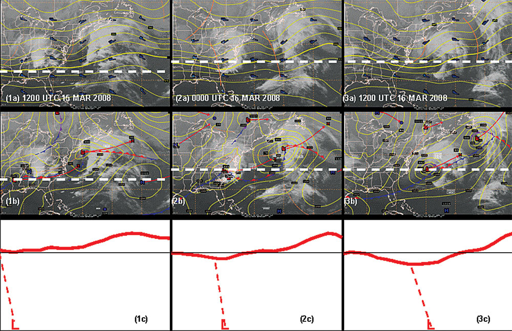
Lets us take a look at the 500 mb and surface pressure patterns associated with a developing Atlantic low pressure system in the late winter of 2008. We illustrate two examples of nine panel images and superimposed 500 mb contour lines as depicted in Figures 7 and 8. The images depict the 12 hourly development of a short wave trough (dashed line) and surface low as they move across the United States and cross into the western Atlantic propelled by strong west to east or zonal flow (this specific 500 mb flow pattern and others to be discussed later). The surface low then strengthens to hurricane force (64 kts and greater) over the central western Atlantic. In Figures 7 and 8, the panels depict satellite images super-imposed over the 500 mb analyses as shown in (a), and also over the surface analyses in (b). The last row depicts the cross-section of 500 mb height in (c) with the surface low extending upward along the dashed red line relative to the respective positions in panels in (a) and (b).
In the first frame of Figure 7 (1a), the 500 mb short wave trough is just coming into view over Oklahoma with the 999 mb surface low centered over southern Arkansas. For the development of a mid-latitude low pressure system, it is necessary for the short wave trough axis in the vertical to tilt back towards cold air (lower heights) with altitude. A typical distance is a quarter wavelength of separation (10-12 degrees in longitude) between the surface low and the 500 mb short wave trough at the early stages of development. Concurrently, a short wave ridge extends southward from Ohio to South Carolina, also about a quarter of a wavelength in advance of this developing storm system.
Twelve hours later in Figure 7 (2a), the short wave trough extends from the Ohio Valley to Georgia with the associated 999 mb surface low over North Carolina. A second short wave trough is dropping southeastward over the Great Lakes. The low has not deepened in the past 12 hours and is rapidly moving eastward approaching the Atlantic coastline, but is expected to deepen rapidly the next 24 hours and intensify to hurricane force as indicated by the associated text box (DVLPG HURCN FORCE).
By 1200 UTC 16 Mar Figure 7 (3), the short wave trough has begun to amplify as the 500 mb heights have lowered over the western Atlantic west of 70°W. The associated surface low has begun to respond, and has deepened 7 mb over the past 12 hours to 992 mb. The cloud structure has become much more organized and has begun to take on a classical comma cloud shape. There are some thunderstorms near the strengthening storm center. Upstream along the west edge of Figure 7 (3a) the 500 mb heights are rising as a ridge moves across the middle of North America. The shortwave trough is now downstream of an amplifying ridge and in a favored location to further amplify and strengthen.
In Figure 8 (1a) at 0000 UTC 17 Mar 2008, the 500 mb trough over the western Atlantic has amplified significantly as the upstream ridge has built up rapidly. The longitude distance between the western Atlantic short wave and the upstream ridge has shortened. The short wave trough no longer appears elongated and has a more curved appearance with the heights falling 60 m as the trough has deepened. The associated surface low has responded to the deepening 500mb trough by intensifying to 972 mb (a drop of 20 mb in 12 hours). Low pressure systems that deepen 24 mb in 24 hours (latitude dependent) are called bombs or explosive deepening cyclones. This storm was certainly an explosive deepener. At this point, peak winds with this system are hurricane force. The longitude distance between the 500 mb trough axis and surface low has closed significantly as the upper level vortex has aligned near the 500 mb center as can be seen in 8(1c). The 500 mb circulation has not yet closed off, as there arent any height contours that have formed a complete closed circle around the center. Once a height contour closes off it means the circulation has grown to 500 mb and is a good indication that the storm system will slow.
By 1200 UTC 17 Mar 8(2a) the 500 mb trough has closed off the 534 decameter contour indicating that the circulation has extended to the 500 mb level. A 500 mb low center now exists at a height of 5280 m with a decrease in depth of 120 m deeper than 12 hours earlier. The reflective surface low has further intensified to a very impressive 965 mb. The scale of the 500 mb trough is also very impressive as it extends from well east of Florida to Nova Scotia.
In the last panel the surface low at 966 mb has risen 1 mb. The 500 mb low center has lowered to 5220 m with a very large circulation from the Canadian Maritimes to well east of South Florida. This surface low has deepened 34 mb in 36 hours with 20 of those in just 12 hours.
Following the lower panels across Figures 7 and 8, you can see that the 500 mb ridge to the west of the shortwave trough rose in height and amplitude quickly between 1200 UTC 16 Mar and 0000 UTC 17 Mar. The short wave trough began to descend by 60 m toward the surface with further deepening to a minimum of 5220 m by 0000 UTC 18 Mar. The slope from the surface low to the 500 mb short wave trough axis has become more vertical as the vortex has grown to the 500 mb level and the cyclone slows. Think of an eddy in a stream as it deepens into the water and begins to slow. The atmosphere is a fluid and lows are eddies embedded in the fluid.
In this sequence, we have seen three stages in the life cycle of a short wave trough. First is the developing phase where the 500 mb short wave lags behind the surface low and amplifies with time. The tilt of the trough axis extending from the surface in the vertical, decreases with time as the surface low deepens. The second or closing off phase is shown in panel 2a and 3a of Figure 8 as height contours begin to encircle the newly formed 500 mb low and close off the vortex. The circulation has become closed from the surface to 500 mb and the surface low slows its forward motion. In the mature phase, the 500 mb low is vertically stacked above the surface low. There is no more deepening and the surface low begins to fill and weaken.
Short Waves and Surface Lows
Figure 7. Nine panel image showing the OPC 500 mb analysis (a), surface analysis (b), and vertical cross section (c) of 500 mb height for (1)1200 UTC 15 MAR 2008, (2) 0000 UTC 16 Mar 2008, and (3) 1200 UTC 16 MAR 2008. In (c), the solid red lines are an exaggerated depiction of the 500 mb height, the dashed line the slope of the trough axis, and the L the position of the surface low.
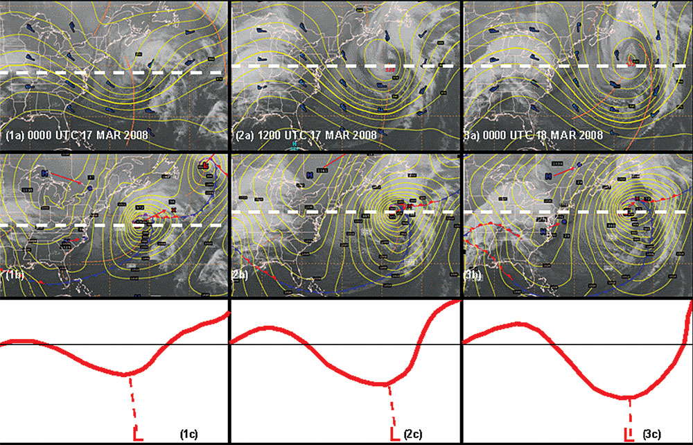
Figure 8. Same as for Figure 7, except for (1) 0000 UTC 17 MAR 2008, (2) 1200 UTC 17 MAR 2008 and (3) 0000 UTC 18 MAR 2008.
To summarize, this low pressure system in 60 hours moved from the Louisiana Arkansas border to south of Newfoundland and intensified rapidly into a very intense ocean storm with hurricane force winds. The rapid speed of motion was a direct result of the 500 mb flow being west to east or zonal. It is also to be noted that vessels transiting east or west bound in transoceanic crossings in such a zonal flow pattern as described above when staying below the bold 5640 500 mb height contour will avoid the heaviest winds and seas located to the north.
Behavior of Short Wave Troughs
Lets follow the 500 mb wind maxima through the development of the 15-18 March 2008 western Atlantic rapidly intensifying cyclone as shown in Figure 9. 500 mb winds of 50 kts or greater are shaded in red and of 100 kts or greater in white. As in Figures 7 and 8, time proceeds from left to right.
Initially, at 1200 UTC 15 March (a), you can see a wind maximum entering the frame from the west over Texas and Oklahoma to the lower Mississippi Valley. Two wind barbs of 60 and 65 kts over western Tennessee and southern Mississippi show southwest and west northwest winds. The two wind barbs show that the flow is diffluent or spreading out a good indication that there is venting going on. The wind flow is not continuous across 500 mb but rather is fragmented into Jet Streaks in association with each short wave trough such as the southern U.S. trough, the trough exiting the mid-Atlantic Coast, and the trough over the central Atlantic. By 0000 UTC 16 March (b), we see that the winds associated with the storm system over the mid-Atlantic have changed little and are still diffluent (air flow spreading out) at 500 mb. Upstream over western Tennessee, a 90 kts wind barb can be seen coming into view. Not only is the flow spreading out but is also slowing by going from 90 kts to 60 kts over North Carolina. In doing so, the flow is producing divergence to the northeast of the leading edge of the Jet Stream (over Pennsylvania and the mid-Atlantic states). This is in evidence by the white cloud mass over the Northeastern U.S. By 1200 UTC 16 Mar (c), the cloud mass remains centered over the left front quadrant of the Jet Stream (left if you look along the flow from west to east). This area is called the left exit region of the Jet Stream and is a favored area for divergent flow and the resulting rising air, which ultimately leads to surface pressure falls and the development of a surface low.
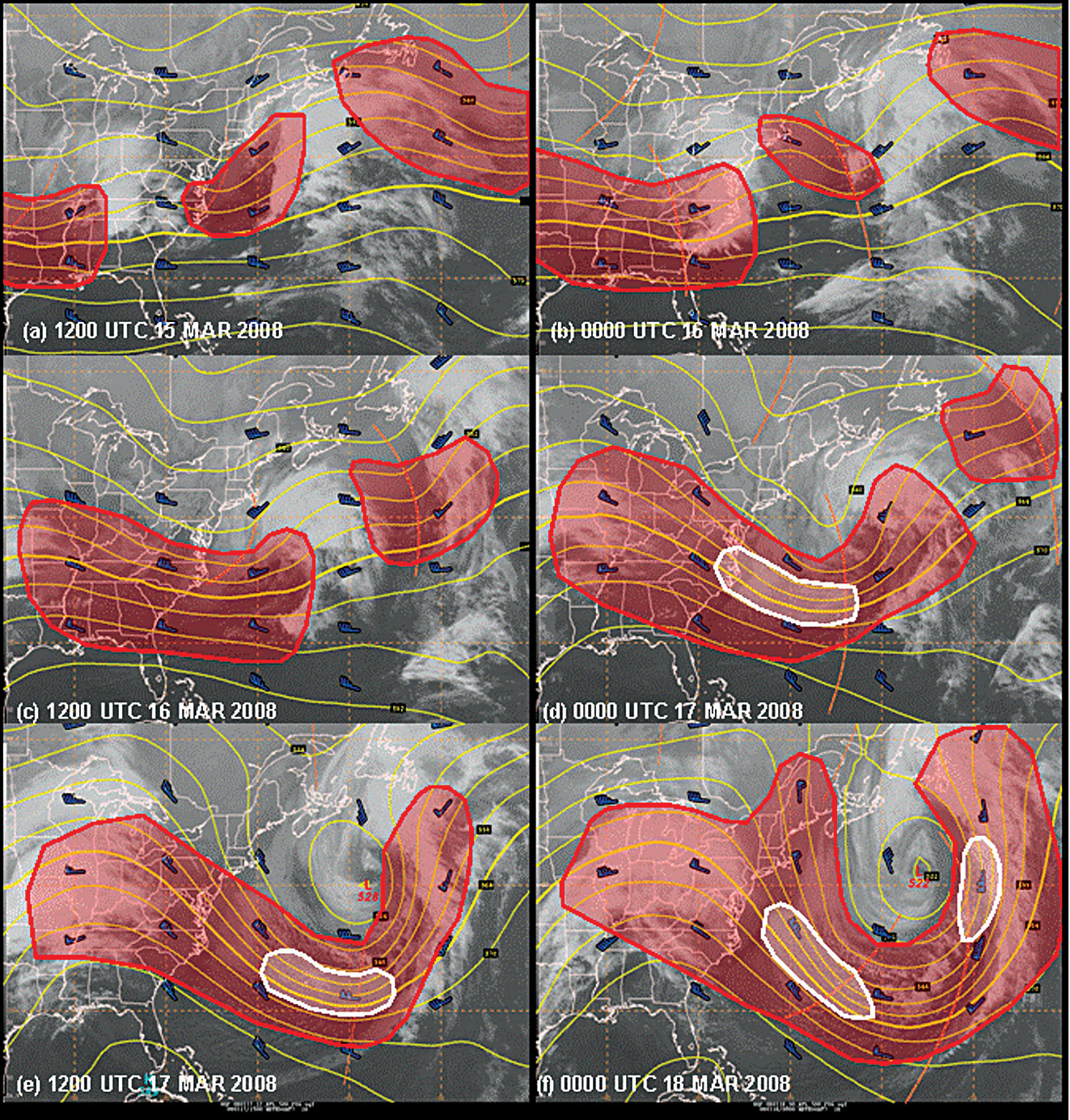
Figure 9. The sequence of 500 mb analyses from 1200 UTC 15 March 2008 (a) through 0000 UTC 18 March 2008 (f). Red shading on 500 mb charts highlights winds of 50 kts or greater. Enclosed white contour shading shows areas of winds 100 kts or greater inside.
The 500 mb flow has changed dramatically from 1200 UTC 16 March (c) to 0000 UTC 17 March (d). The upstream ridge over the central U.S. has significantly amplified, while at the same time the short wave trough has also amplified into an evident deeper trough. The 500 mb height contours to the west of the trough axis to the North Carolina coast have really tightened together. The 95 kts wind over North Carolina suggests that the wind downstream is exceeding 100 kts as evidenced by the white shading. In essence as the overall pattern has amplified, the height contours have compressed together and the winds have greatly increased. East of the trough axis (brown dashed line), you can see how the flow is spreading out. A wind barb of 65 kts can be seen south of Nova Scotia in south-southwest flow, another 65 kts wind in southwest flow can be seen farther south, a third wind barb of 45 kts west wind can be even seen further south. The wind maximum is still upstream of the trough base and suggests more deepening of surface low is possible.
In (e), the upstream ridge has continued to amplify, and the 100 kts wind maximum extends into the base of the trough. Overall we have seen though this evolution the wind flow increase as the short wave has amplified. The 500 mb trough has begun to close off as the 534 decameter contour has formed an enclosed circle and the 500 mb low has formed. In essence, the circulation has extended upward into the atmosphere to 500 mb, near vertical with the surface low.
By 0000 UTC 18 March (f), the 500 mb low now has three height contours encircling the upper low center: 522, 528, and 534. Two jet stream flows are now evident feeding into the low. First is the southern stream extending from the upper Midwest of the U.S. and now a branch of the northern stream, can be seen centered on northern Maine. One could think of the southern stream supplying the moisture and the northern stream providing the cold air. The 100 kts contours or isotachs have formed into two maxima. The first is the northwest maximum from the mid-Atlantic coast southeastward to the base of the trough. A second maximum has developed east of the 500-mb trough in southerly wind flow. Typically when this occurs, the surface low has reached maximum intensity or minimal central pressure. The flow on either side of the trough is balanced. Although it is not shown, over time the maximum leading into the trough will weaken and the newly formed jet stream maximum east of the trough axis will increase. When that happens, the surface low and associated shortwave trough will begin to lift out. This low remained stalled for several days as the upper level flow remained balanced.
In review, the greatest deepening in the surface low took place between 1200 UTC 16 March and 0000 UTC 17 March, as both the 500 mb ridge and downstream trough amplified. The surface low and upper level 500 mb low became vertically aligned by 1200 UTC 17 March, as the surface low reached its lowest central pressure and most intense conditions.
500 Millibar Patterns
Now that we have gone over the behavior of 500 mb short wave troughs and surface cyclones, lets take a look at some typical 500 mb flow patterns.
Zonal Pattern
Rapid west to east flow where the 500 mb height contours are also aligned west to east is referred to as zonal flow (Figure 10). Any short wave troughs embedded in zonal flow patterns tend to move rapidly from west to east. Short waves are not usually highly amplified in a viewing aspect, but the 500 mb winds often compensate by being quite strong (100 kts or more) to support intense surface lows. Also, it is not unusual to see surface lows and their associated fronts move 35 to 50 kts of 1/3 to1/2 of 100 kts in this case. Thus a good rule of thumb: a surface low or front embedded under a 500 mb zonal flow pattern in winter will move, on average, between 30 to 50 percent of the 500 mb wind speed.
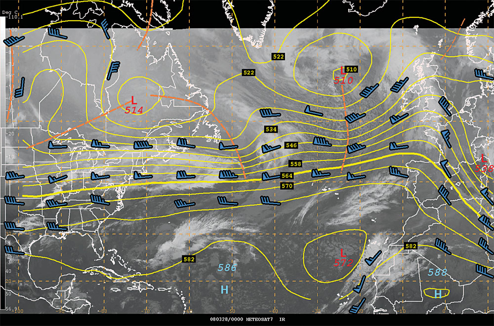
Figure 10. Zonal flow 500 mb pattern across the North Atlantic from 0000 28 March 2008.
In Figure 10, westerly wind flow at 500 mb extends from central North America across the Atlantic to western Europe with an 85 kts maxima over the mid-Atlantic southeast of Newfoundland and again south of Iceland north of the Azores. Surface fronts embedded in these areas may move as rapidly as 40 to 45 kts. Zonal flow patterns tend to be unstable and short lived. They often break down into a more amplified pattern fairly rapidly. When a transition from a zonal to a more amplified or meridional flow pattern is taking place, a strong surface low of storm force or hurricane force will usually develop. This was the case in the example shown in Figures 7, 8, and 9.
Meridional Pattern
In a meridional flow pattern, the contours have more amplitude (north-south orientation) than in a zonal flow pattern (see the example from the North Pacific in Figure 11). In other words, the height contours cross more latitude lines than longitude lines. Meridional flow patterns tend to move cold air south and warm air north in a highly visible aspect when comparing to a zonal flow pattern. Surface lows and 500 mb short waves will move more toward the north or south along a meridian than in a zonal pattern. In this example a surface low existed near 42°N 150°W to the east of the 50 kts wind barb. That low was moving due north at 20 kts.
Remember that the 500 mb field is in motion. Therefore, it is an excellent idea to look at the 500 mb forecasts to see how the pattern is expected to evolve over the next several days. It is not unusual to have a progressive meridional flow pattern (movement from one region to another over the same ocean from west to east) where the 500 mb short wave troughs and ridges, although they are amplified, continue their eastward progression across longitude lines in time.
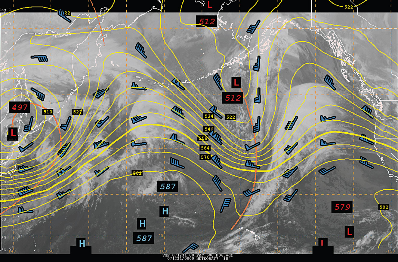
Figure 11. An amplified meridional pattern over the North Pacific from 0000 UTC 31 December 2007.
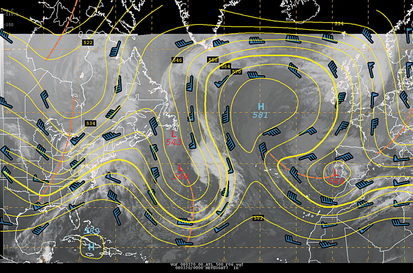
Figure 12. A blocked North Atlantic pattern from 0000 UTC 20 march 2008 with a large blocking high mid way between Ireland and Newfoundland.
Blocking Pattern
A high amplitude ridge that blocks the west to east progression of the upper level Westerlies is aptly named a blocking ridge. Figure 12 shows a blocking pattern with a large ridge blocking the Westerlies over the central North Atlantic. The large 5810 m High at 50°N 30°W is said to be a blocking high and is blocking the west to east progression of weather systems. A characteristic of a block is when there is large open longitude space between height contours of the same value that cover up to sometimes 30° of longitude. Thus there is very little air flow penetrating the area, and so we refer to this as a blocking pattern.
In a blocking pattern, 500 mb short waves will be steered generally northward over the blocking ridge. In this example a strong shortwave can be seen in the satellite image just rounding the base of the trough along 50°W. The associated surface low is lifting north northwest parallel to the 500 mb contours because it is blocked to the northeast. If the amplitude of the ridge is large enough, then short wave troughs approaching from the west may try to undercut or drive under the block. This undercutting helps to set up a split in the westerly flow to the west of the blocking ridge, and eventually helps to break down the block. In this example, the high has not built northward enough to allow lows to pass to the south of it. Blocks may last 10 days or more.
Closed lows that form west or to the left of a blocking ridge and dig southeastward tend to be fairly strong and it is not unusual to have surface winds at 45 to 50 kts to the west and southwest of the surface low. Favored areas for this to happen are near the Azores and northwest of Hawaii. The rule of thumb described earlier where up to fifty (50) percent of the 500 mb wind speed can translate to the surface aptly applies in this scenario.
Cut-off Lows
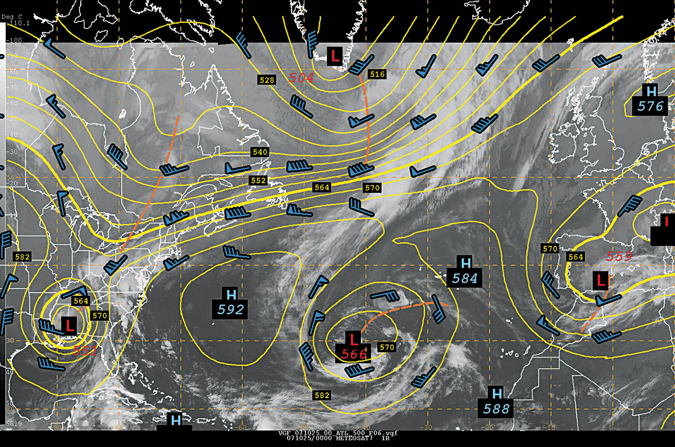
Figure 13. Depicts near zonal flow extending from eastern Canada, to near 30 degrees West longitude over the Atlantic, with two cut-off lows to the south. The first is over the southern United States. The second cut off is near 30 degrees N, and 41 degrees W longitude.
If a 500 mb meridional flow pattern becomes amplified enough, then it is possible for an upper-level low to form in the southern boundary of the upper-level westerlies and become cut off as shown in Figure 13. The closed upper level circulations associated with the lows over southern Alabama, the mid-Atlantic (30°N, 42° W) and Spain are cut off from the main stream of upper level zonal west to east winds north of 45° to 50°N. Weak ridges separate the higher latitude westerlies from the three 500 mb cut-off lows. Cut-off upper level lows tend to remain stationary, and can persist for several days, sometimes up to two weeks. They may be accompanied at the surface by strong winds when they first form (in particular, in the north to northwest wind flow to the west of the developing surface low), along with showers, and thunderstorms. Also, it is not unusual also to have strong surface east and northeast winds to the north and northeast of the surface low center, due to the strong pressure gradient between the surface low which will be centered directly under the 500 mb cut-off low and a surface high to the north or northeast. Cut-off lows either gradually weaken, or are picked up by the higher latitude upper-level westerly flow when the pattern amplifies again and the capping ridge to the north of the 500 mb cut off low breaks down. They tend to occur most in the spring and fall when the upper level Westerlies migrate north and south, respectively, due to north-south changes in temperature with transition between winter to spring and summer to fall.
These are just samples of several basic 500 mb flow patterns. At any given time a variety or combination of patterns may exist over the same ocean basin. It is not unusual in the Pacific Ocean to have strong zonal flow over the western Pacific with a meridional flow or even a blocking flow pattern over the eastern Pacific.
Derivation of the 500 mb Height Field
You might wonder how the 500 mb height field is determined over the oceans. Globally, each day at 0000Z and 1200Z over the continents, at selected island sites and on several specially equipped merchant ships, weather balloons are launched to sample the vertical structure of the atmosphere. One of the mandatory levels at which the height, wind, temperature, and moisture (dew point) data are measured is the 500 mb level. Although balloon data is scarce over the oceans, ship surface weather observations, commercial aircraft reports at jet stream levels, satellite and satellite derived moisture profiles, and wind estimates, are all combined and quality controlled to help determine the initial state or three dimensional structure of the atmosphere over the oceans. In addition, 6 hour forecasts from the operational computer forecast models are used as a first estimate as to the initial state of the atmosphere. Think of all the global observations being used to tweak the previous computer model forecasts in the right direction, which makes for relatively consistent model forecasts. Note that your ship observations have a critical impact in determining the three dimensional structure of the atmosphere.
The highly sophisticated operational forecast computer models that simulate the atmosphere are then run using the analysis determined from the combination of the observed data (including ship reports) and previous model forecasts. The 500 mb height fields from the analysis process and 48 and 96 hour forecasts from the National Centers for Environmental Prediction (NCEP) Global Forecast System (GFS) are extensively used as the basis for the OPC forecaster produced graphics.
Application of 500 mb in the Tropics
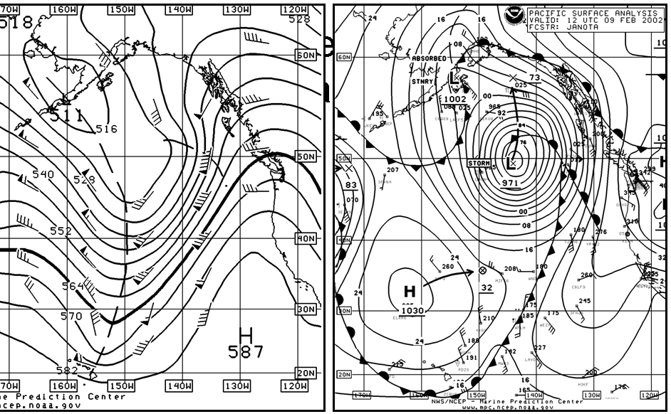
Figure 14. 500 mb analysis (left panel) and surface analysis (right panel) for the eastern North Pacific from 1200 UTC 9 February 2002 showing a deep 500 mb trough and associated cold front southeast of the Hawaiian Islands.
Figure 14. 500 mb analysis (left panel) and surface analysis (right panel) for the eastern North Pacific from 1200 UTC 9 February 2002 showing a deep 500 mb trough and associated cold front southeast of the Hawaiian Islands.
500 mb charts are normally best suited for application in the mid and high latitudes where temperature contrasts can be large, the wind flow tends to be strong and surface weather systems movement and intensity respond in synergy with the evolution of the flow patterns at 500 mb. However, there are applications in tropical regions. For instance, in winter in a strongly amplified pattern, the mid-latitude 500 mb flow can dig down into the tropics. A good example would be a strong cold front pushing as far south as the Caribbean Sea, the Philippines or Hawaii. In Figure 14, an example from February 2002 with a cold front that had passed south of Hawaiian Islands. Notice how far south the 500 mb contours and flow had pushed south into the tropics.
The movement of tropical cyclones such as in the western Pacific or the Atlantic is a second important application of the interaction of the 500 mb flow pattern in the near tropics and tropics. The 500 mb pattern and satellite imagery from 1200 UTC 6 September 2008 are shown in Figure 15. In addition the 24 and 48 hour forecast positions for Tropical Storm Hanna and 24, 48, and 72 hour forecast positions for Hurricane Ike are shown in Figure 14. Hanna has one closed 581 decameter height contour associated with it, and if you follow the surrounding flow see that Hanna is in an area of confluent southwesterly flow. You could think of Hanna having just entered the highway of the Westerlies from an on ramp from the tropics. The corridor between the 588 and the 582 decameter contour (the latter completely extends across the hemisphere) provide the lane for Hanna to move at about ½ the 500 mb wind speeds and parallel to the 500 mb height contours (see Heavy Weather Avoidance by Chen and Chesneau). The cloud structure of Hanna has been stretched to the northeast over the Northeast U.S. into Quebec. It is no surprise that Hanna is being picked up or absorbed into the Westerlies of the mid latitudes. The 24 hour forecast position east of Cape Cod and 48 hour position east of Newfoundland suggest Hanna will race to the northeast.
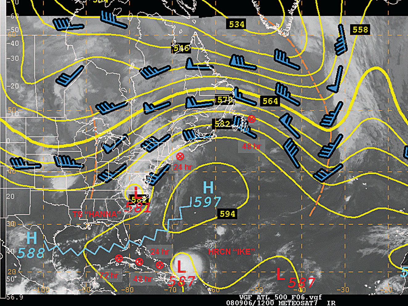
Figure 15. 500 mb height, winds and satellite image from 1200 UTC 6 SEP 2008. Tropical Storm Hanna can be seen over North Carolina. Hurricane Ike is east of the Bahamas. 24 and 48 hour forecast positions for Hanna and 24 through 72 hour forecast positions for Ike are shown by the symbols of red Xs with circles.
Hurricane Ike is east of the Bahamas well in the tropics. To the north is a strong 500 mb 597 decameter high with a ridge of high pressure (zig-zag blue line) extending southwest to south Florida and then west across the Gulf of Mexico. Here is an excerpt from the National Hurricane Center discussion on Ike from 1500 UTC 6 September, 2008:
Ike is currently being steered by a large middle to upper-level ridge over the western atlantic near bermuda and the cyclone continues on a general west-southwestward heading with an initial motion estimate of 255/15. The ridge is forecast to shift eastward during the next couple of days allowing ike to make a turn westward.
The ridge that is steering Ike is the 597 decameter high and ridge axis extending to the southwest and west from the high that is evident in the 500 mb analysis. Ikes south of west motion is in fact due to the southwest orientation of the extending ridge axis prior to this time the hurricane was moving west as it was south of the blocking high to the north. The hurricane forecaster is referencing the 500 mb pattern in the official discussion for a hurricane in the tropics and attributing the motion of the hurricane to the mid level flow features that can easily be seen on the 500 mb analyses and forecasts. Tropical Cyclone Discussions issued by the National Hurricane Center are an invaluable resource and should be used with surface and 500 mb analyses from the OPC to keep abreast of the evolution and track of tropical cyclones. The Tropical Cyclone Discussions are available on the NHC website: http://www.nhc.noaa.gov . You can also request the TCDs using email via ftpmail. Directions for ftpmail can be found at: http://weather.noaa.gov/pub/fax/ftpmail.txt.
The Bottom Line
One way to use the 500 mb charts is to set up a display of both surface and 500 mb analyses along with the 24 48 and 96 hour forecasts in the chartroom or on the bridge or set up a display on a computer. You may want to outline the wind maxima associated with each trough expected to affect your ship or sailing vessel, and gain experience that way. Is the wind maximum to the west, evenly distributed, or to the east of the short wave trough? In other words will the trough dig (intensify), lift out (weaken), or just stay steady state in the overall 500 mb flow pattern? Take a look at the previous forecasts. Are there any big changes from the earlier forecast sequence series of surface and 500 mb analyses and forecasts to the current series?
Remember that the 500 mb flow patterns and specific short waves are directly linked and associated with the motion and life cycle of surface low pressure systems. In other words they are linked three dimensionally and thus inseparable! Look at the progression of the 500 mb flow pattern(s) from analysis time through 24-48 to 96 hours. Is the pattern becoming more meridional, zonal, blocked, or cut-off over the next 4 days? Next, look at specific 500 mb short waves, and their associated surface low pressure systems, along with other features (fronts, squall lines, troughs, or ridges) that will be affecting you over the next several days. Think of the examples in this article. You may want to mark the position of surface lows on the 500 mb chart to see how the surface low relates to the 500 mb short wave trough (does the trough tilt with height with the surface low or is the system vertically stacked).
The bottom line is that through some experience on your own and with knowledge gained through watching the evolution of the weather and comparing surface and 500 mb analysis you will begin to anticipate how weather systems will move and intensify or weaken. While the 500 mb analysis and forecasts doesnt always provide the answer it does give you a much clearer picture as to WHY weather systems are behaving the way they do, why some systems can cross an ocean in just a few days and why some systems do not move at all for days on end.
Back to top